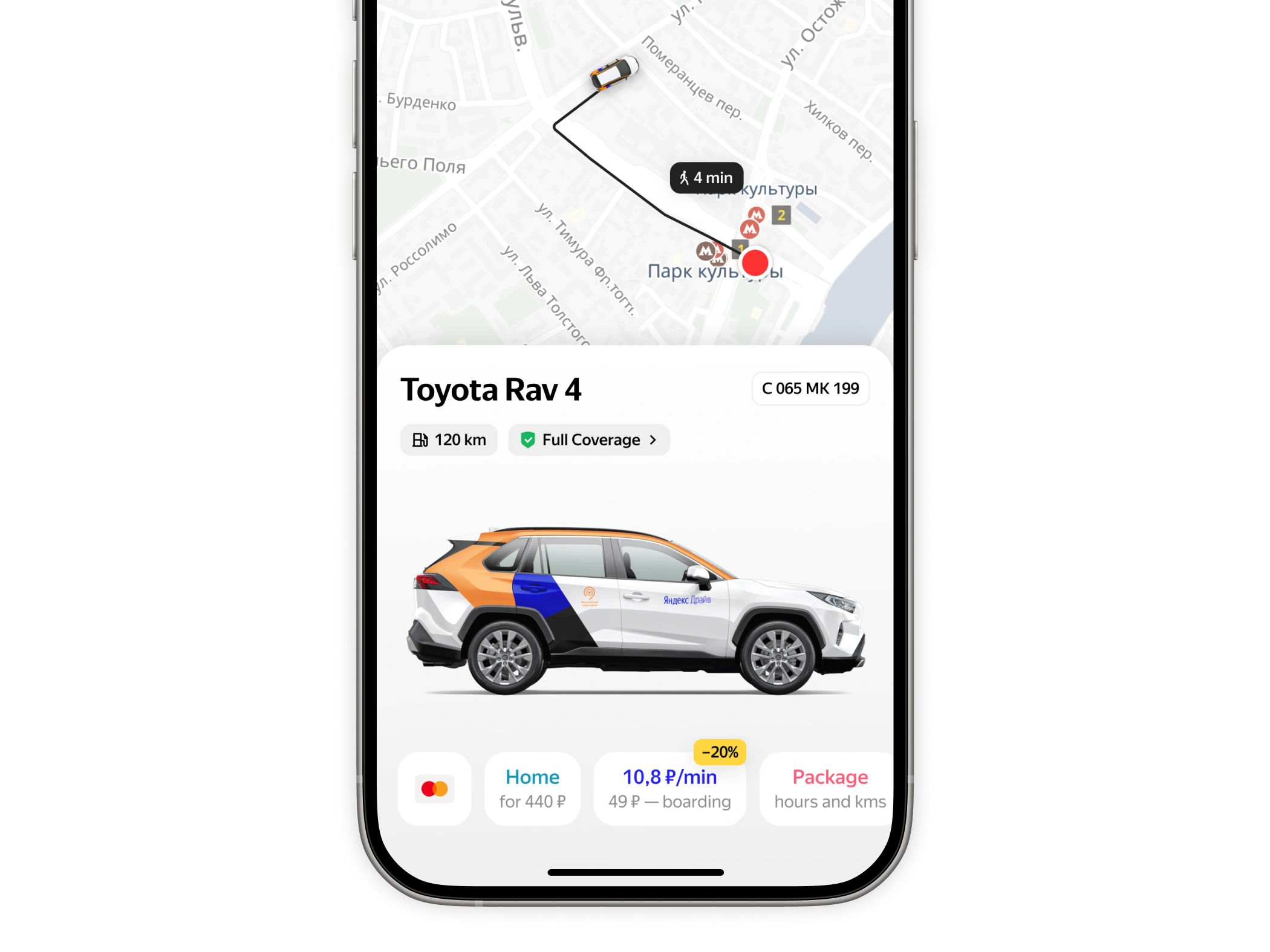
Yandex Drive is one of the largest carsharing services in Russia and Europe. The vehicle card is where users check car details, choose a rate, and book. Everything goes through this screen.
Problem
The old card had served well, but as the service grew, it couldn't keep up.
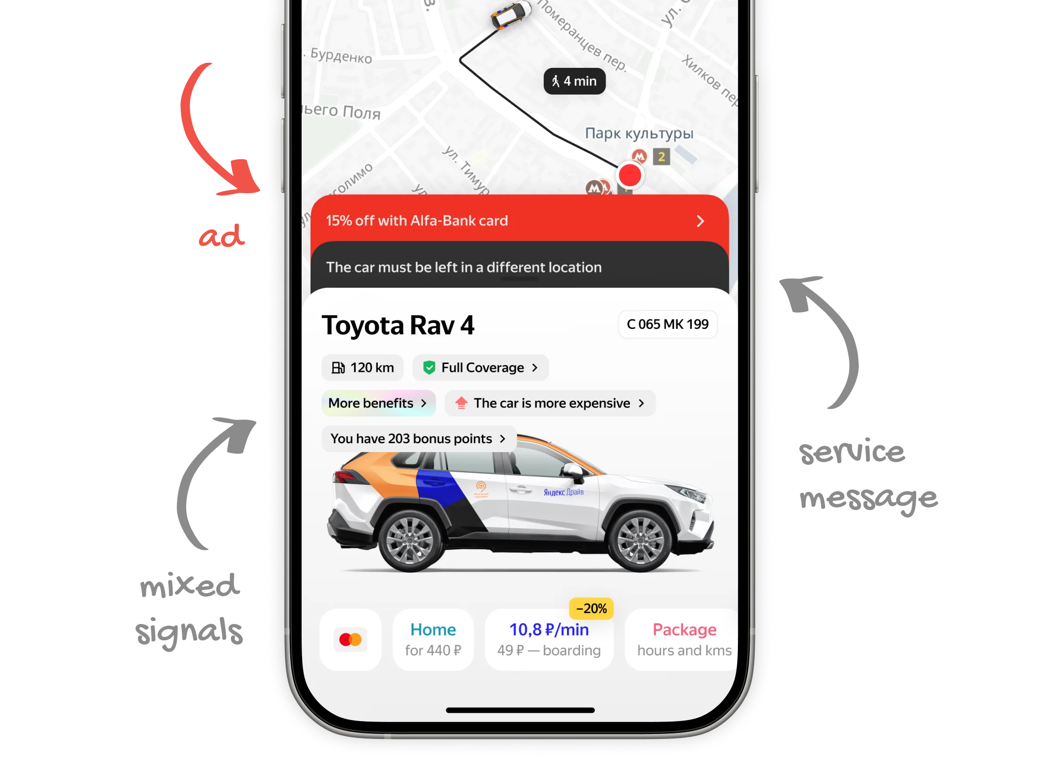
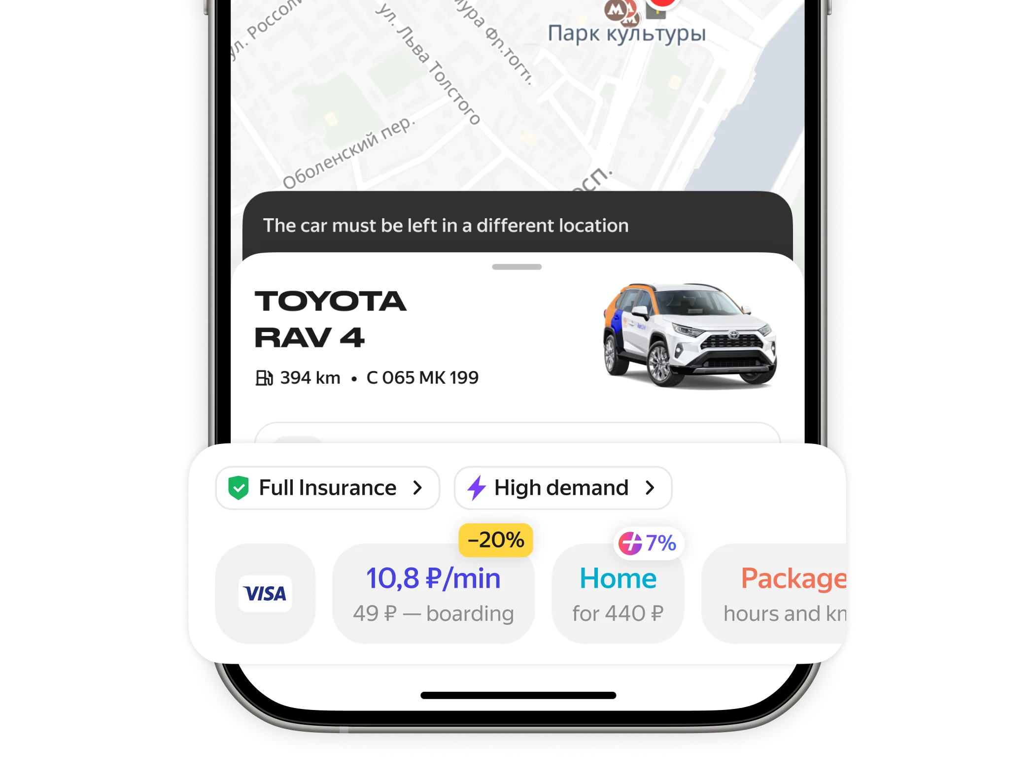
Two elements above the card — we called them "ears" — were sending completely different signals: one technical, one promotional. Once users learn to ignore ads in that spot, they stop noticing critical service messages too, like a car parked in a restricted zone.
The chips below were a mess of mixed signals — insurance, discounts, bonus points, all crammed together. All of this, plus an oversized car render, made the card too heavy and too tall. There wasn't enough room for the map, which users need to evaluate their route.
Solution
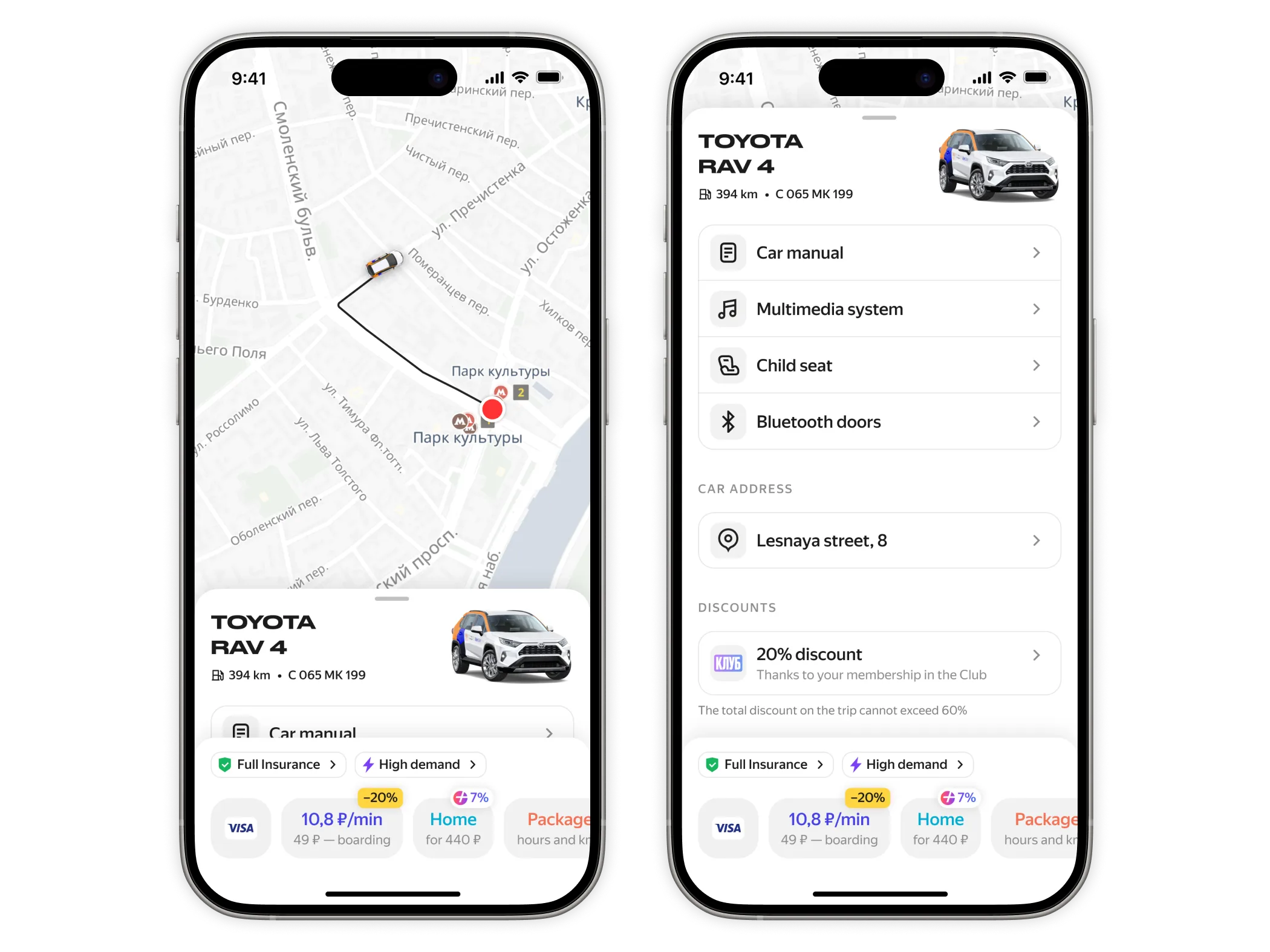
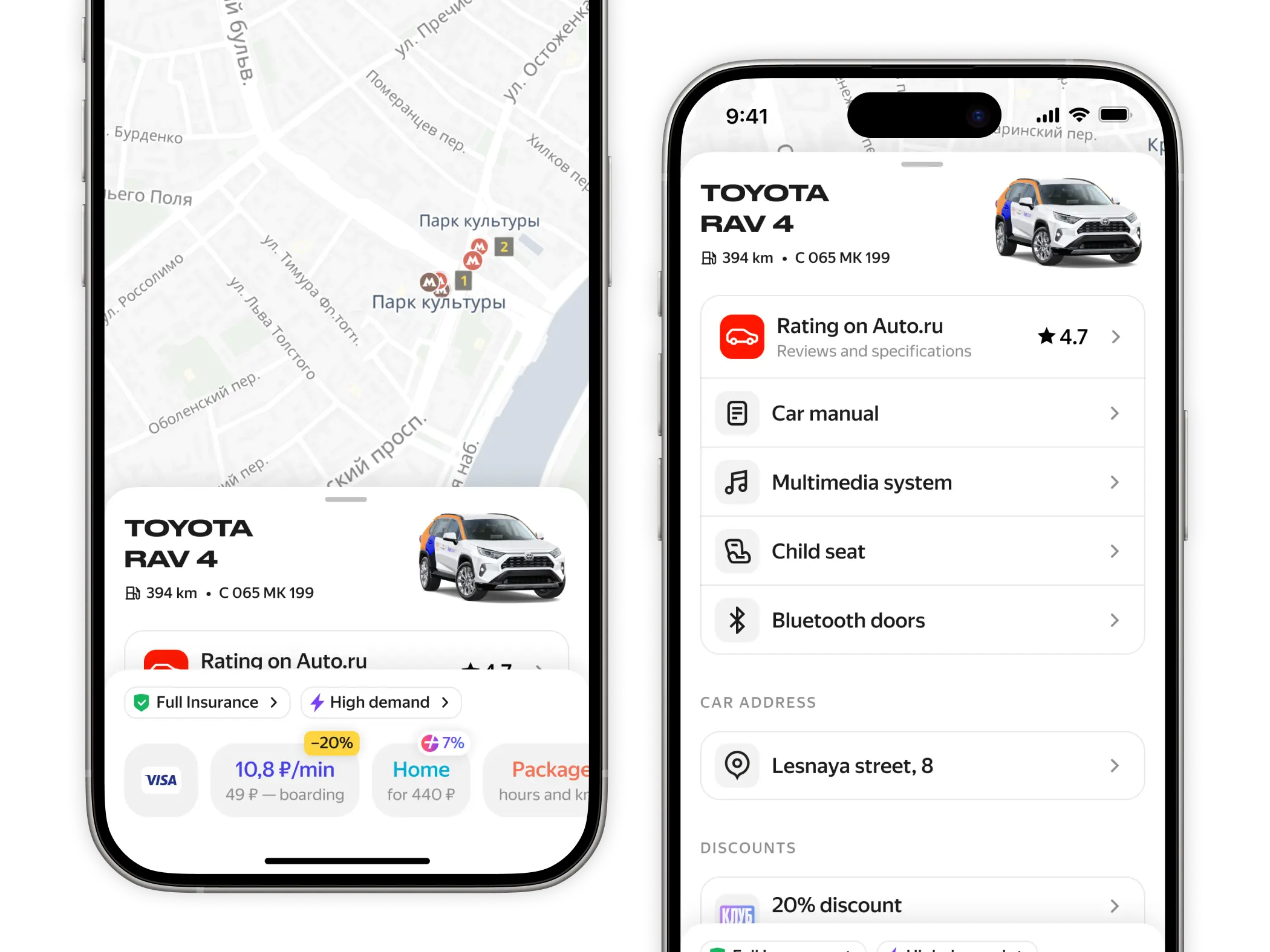
The new card is significantly shorter — the map and route are easier to read.
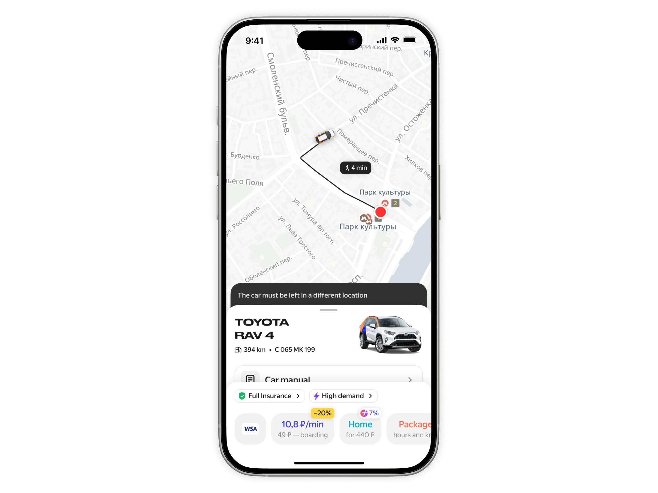
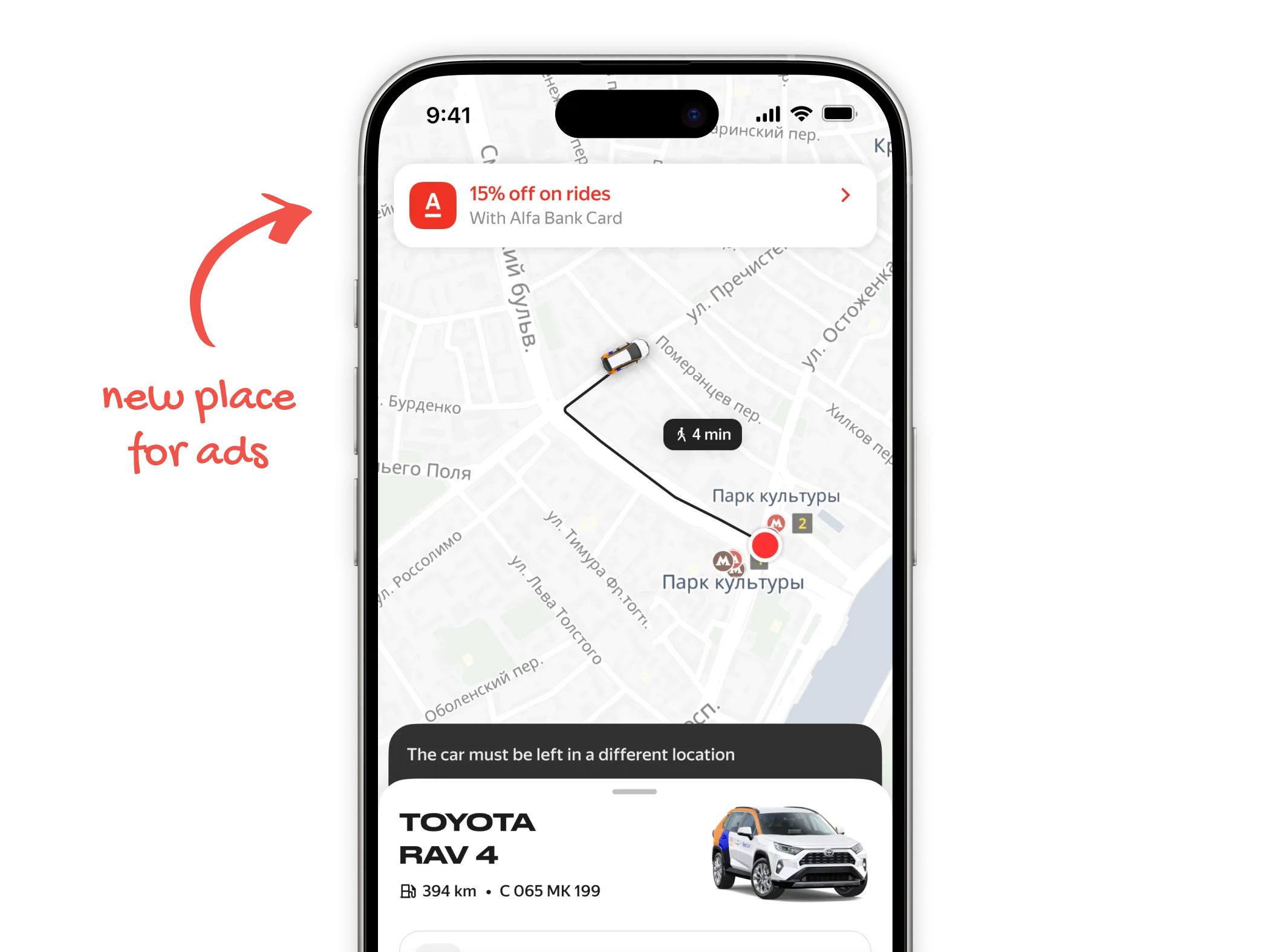
Ads got their own dedicated space at the top. Ears went back to what they were made for: important service messages only.
Factors that affect the price — insurance, high demand — now sit right next to the rate buttons. Why is this car more expensive? Because you have insurance on, and demand is high. The answer is right there.
There were smaller but important problems too.
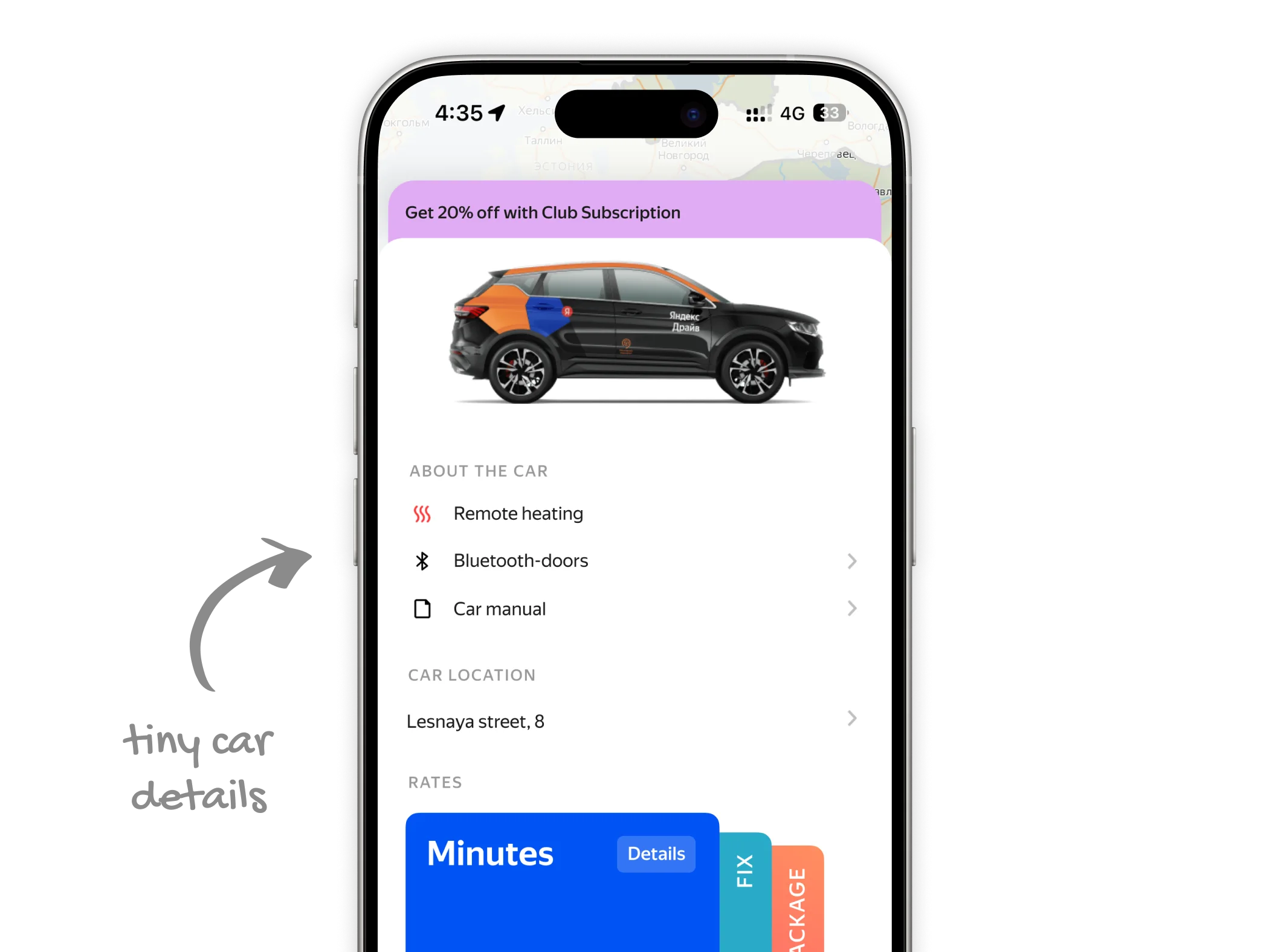
When users expanded the old card, they could see car options — child seat, transmission type, a manual we prepared for each car model with photos and explanations. But people rarely noticed them. They'd contact support instead.
The new card teases this content in the collapsed view, making it clear there's more behind the fold. The options themselves are more visible and better organized.
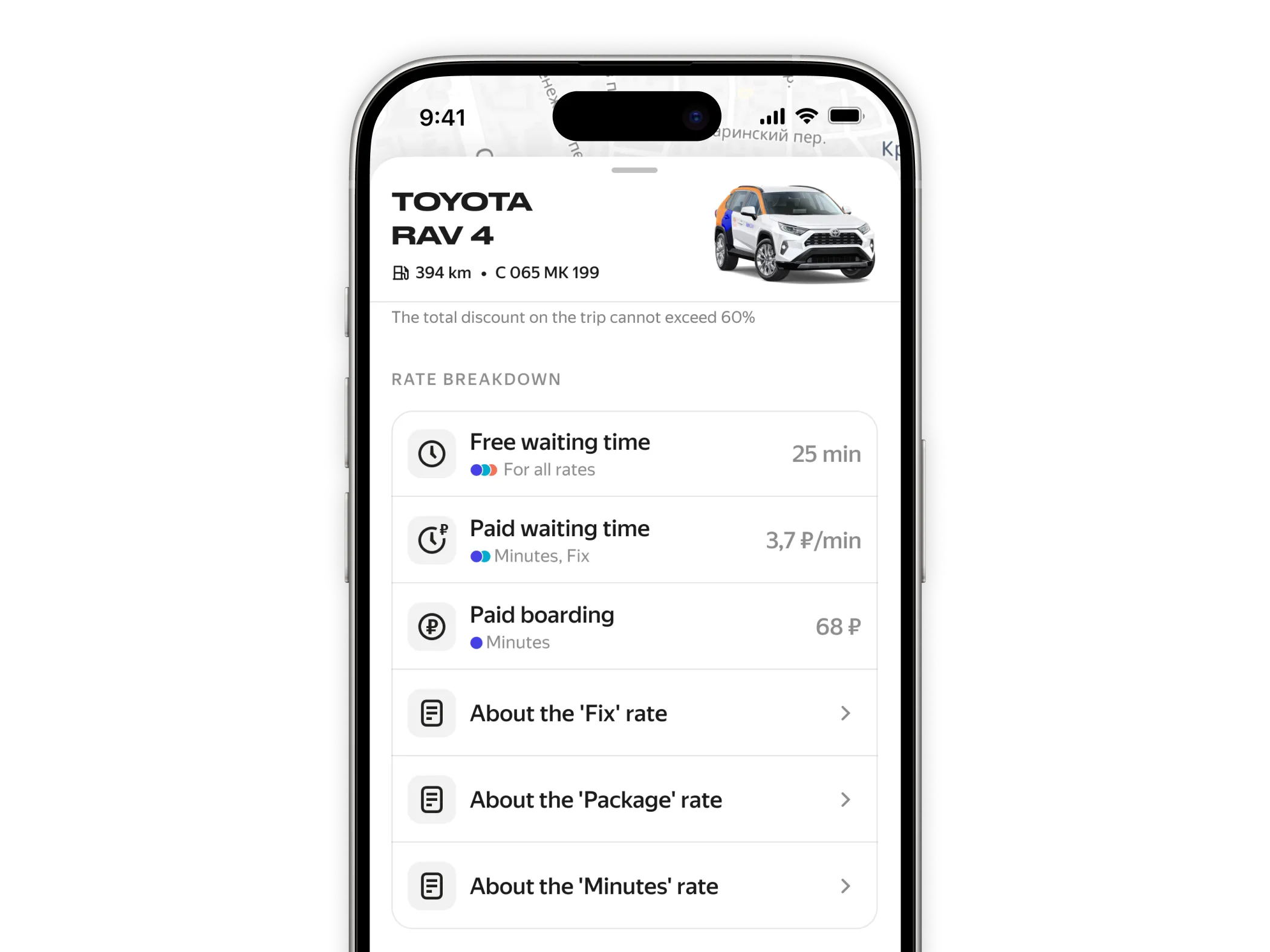
We also had duplicate rate cards in the expanded view — they repeated what the small buttons already showed, and still didn't give full details. I learned from support that users frequently asked about specifics like waiting costs per rate.
So I designed a transparent table that lays out all rate details in one place.
Results
The main win: we didn't break anything. The experiment showed no drop in booking conversion. But we noticed users were opening the card 44% more and engaging with car details they had previously ignored.
This opened the door for two things. First, ecosystem partnerships — Yandex has a car marketplace, so we embedded a link to the car's listing on Auto.ru with pricing and loan offers.
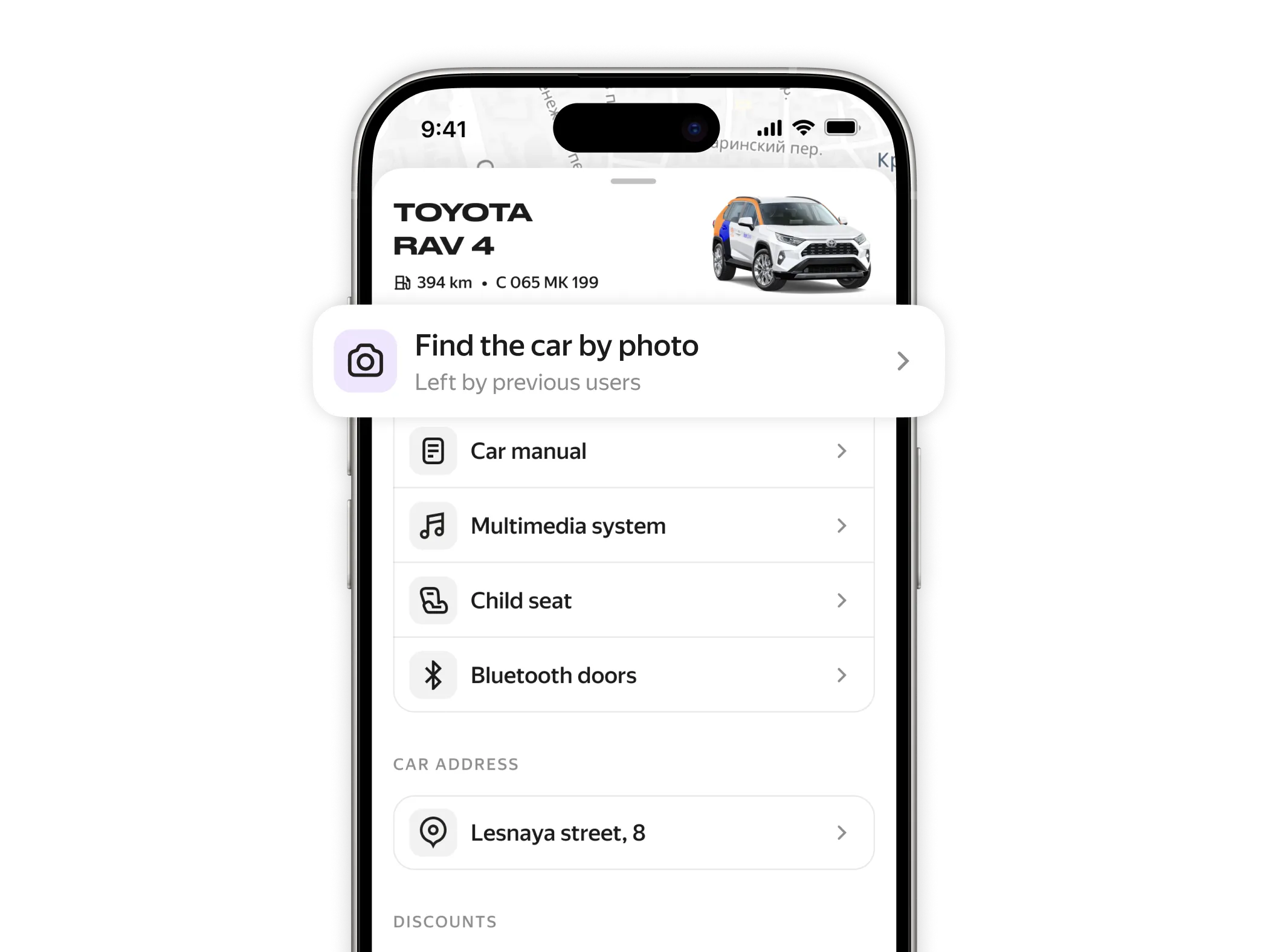
Second, experimental features — like finding a car by a photo left by the previous user.
Fin