Proof was a fintech card: fiat accounts and crypto wallets behind one Mastercard. I joined as the founding designer, in a team of people from TON, Revolut and Yandex.
The product was built but never launched. Here's what we made.
Home
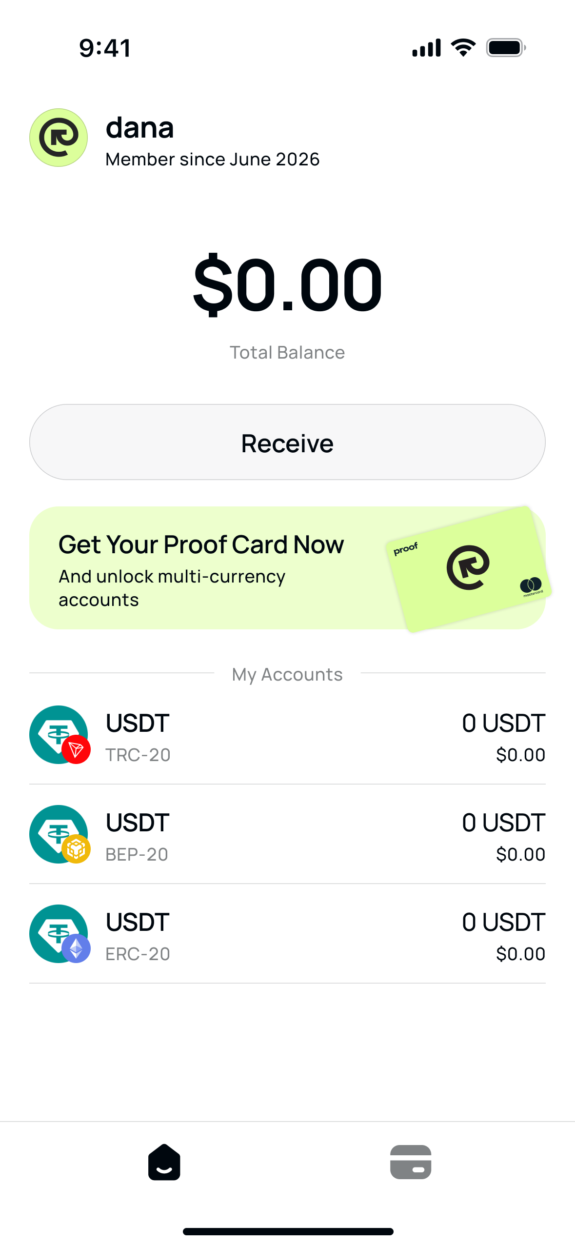
The main screen answers one question: how much money do I have. A new user starts at zero and sees one next step — get the card.
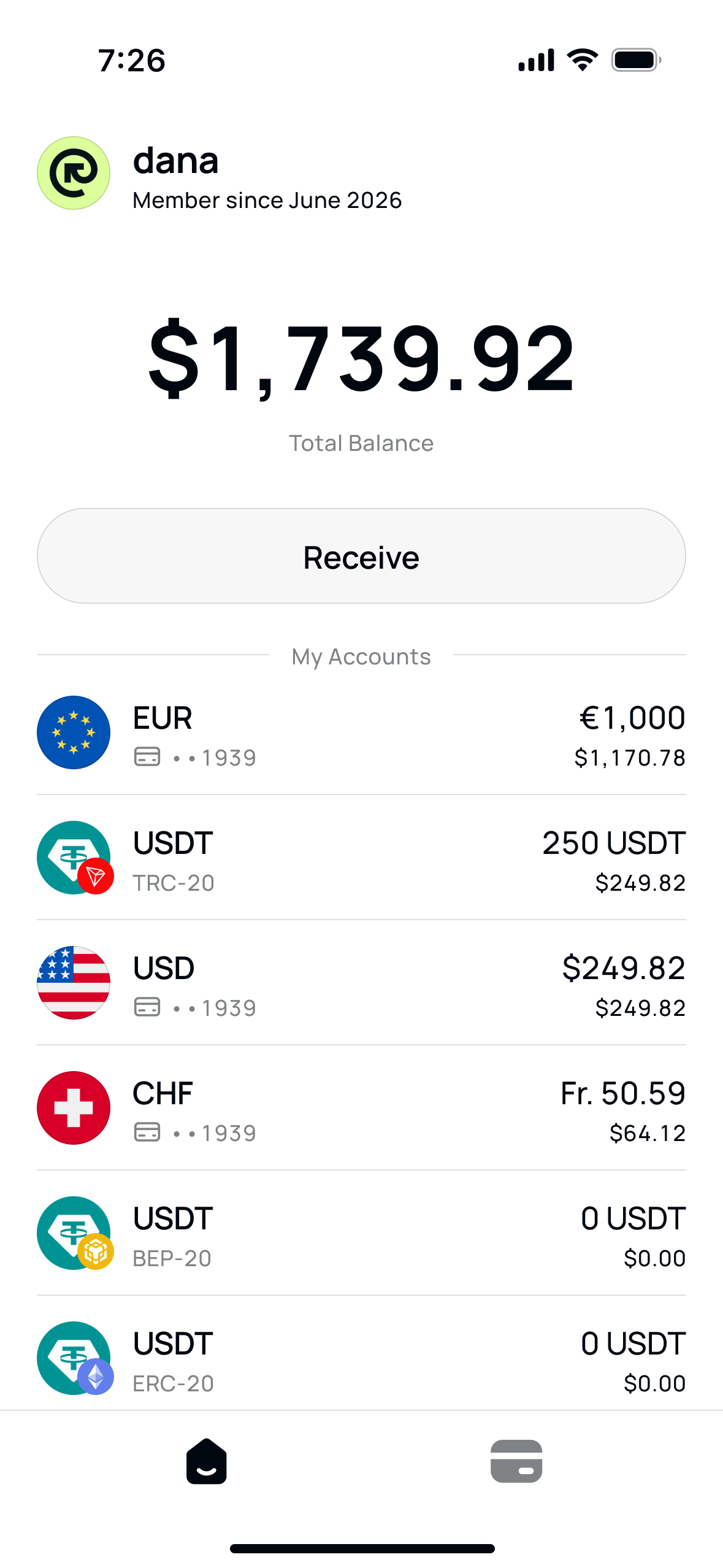
Accounts
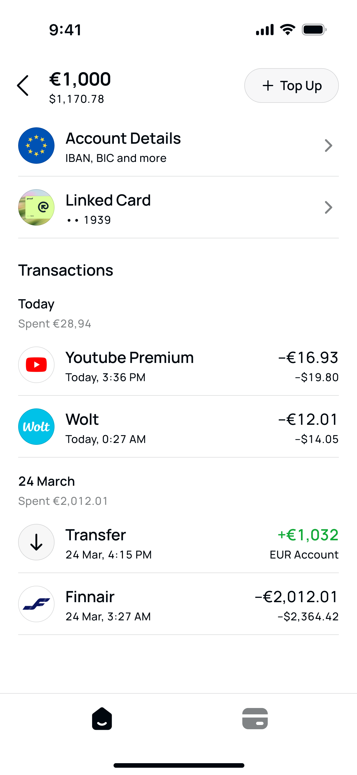
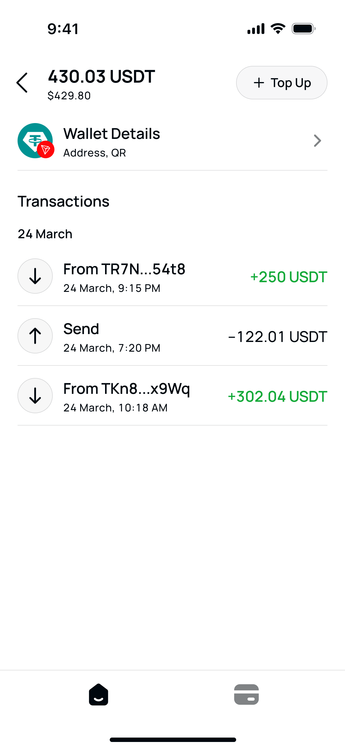
A fiat account and a crypto wallet are the same screen. Only the details differ. Learn one, and you know both.
Card
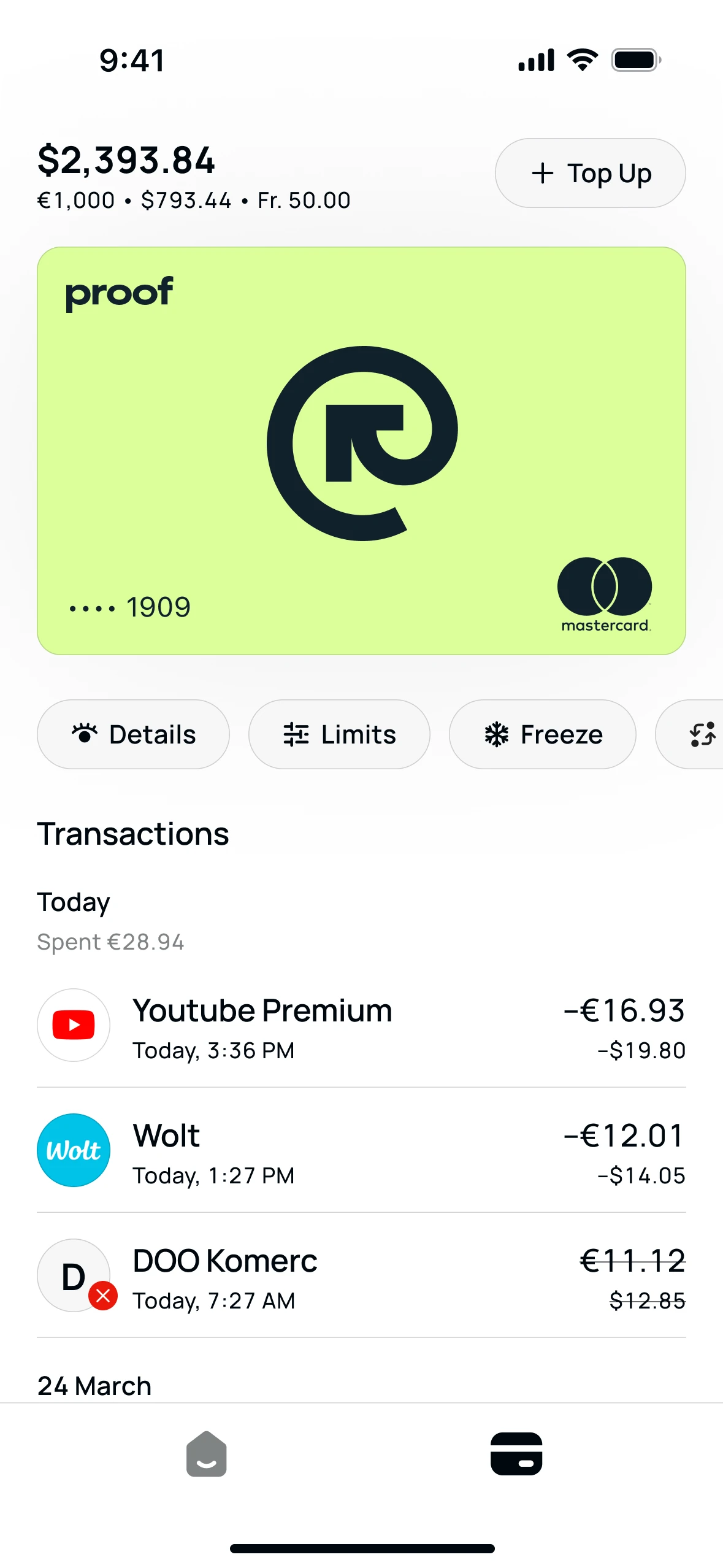
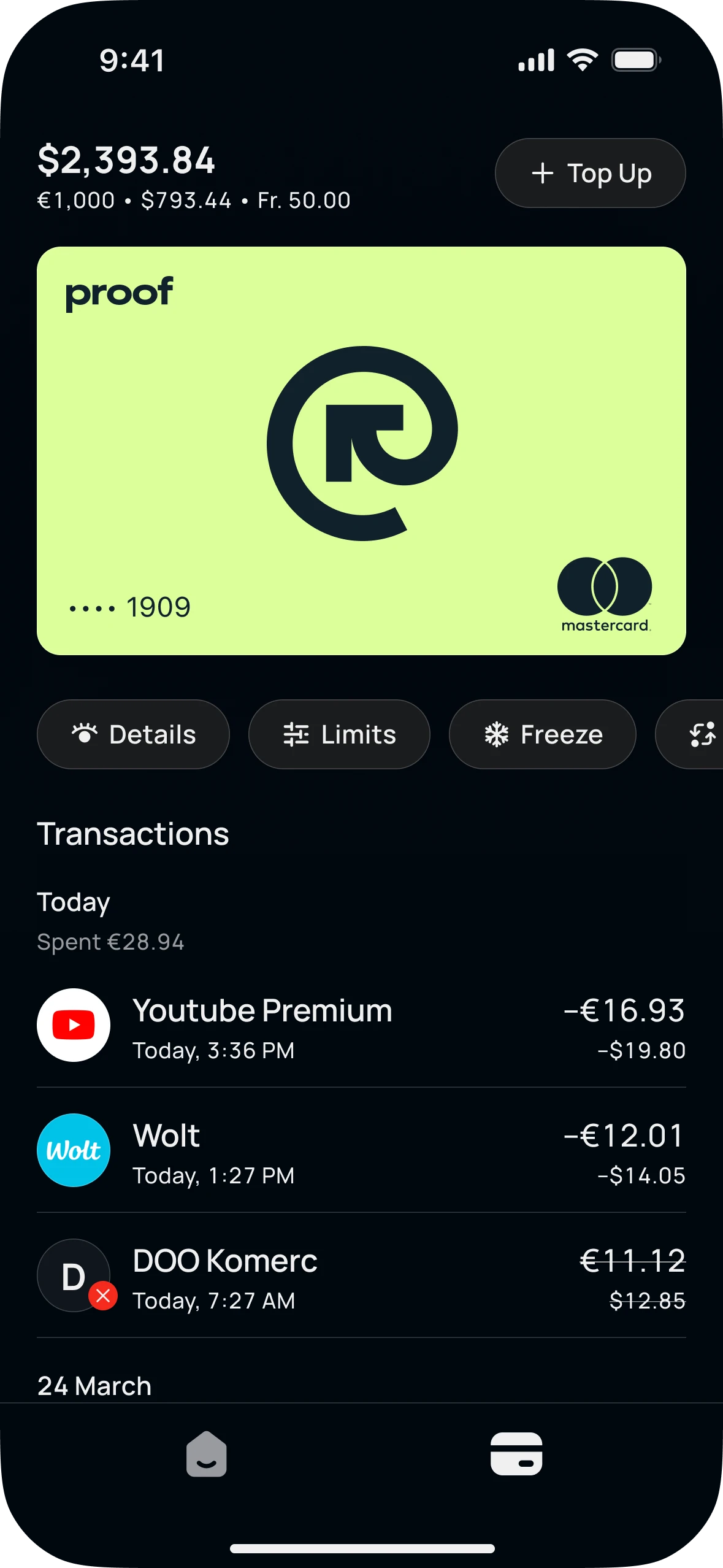
The card gets its own tab: the balance it spends from, the card, and the few actions people actually use. The dark theme comes from the same tokens.
Sheets
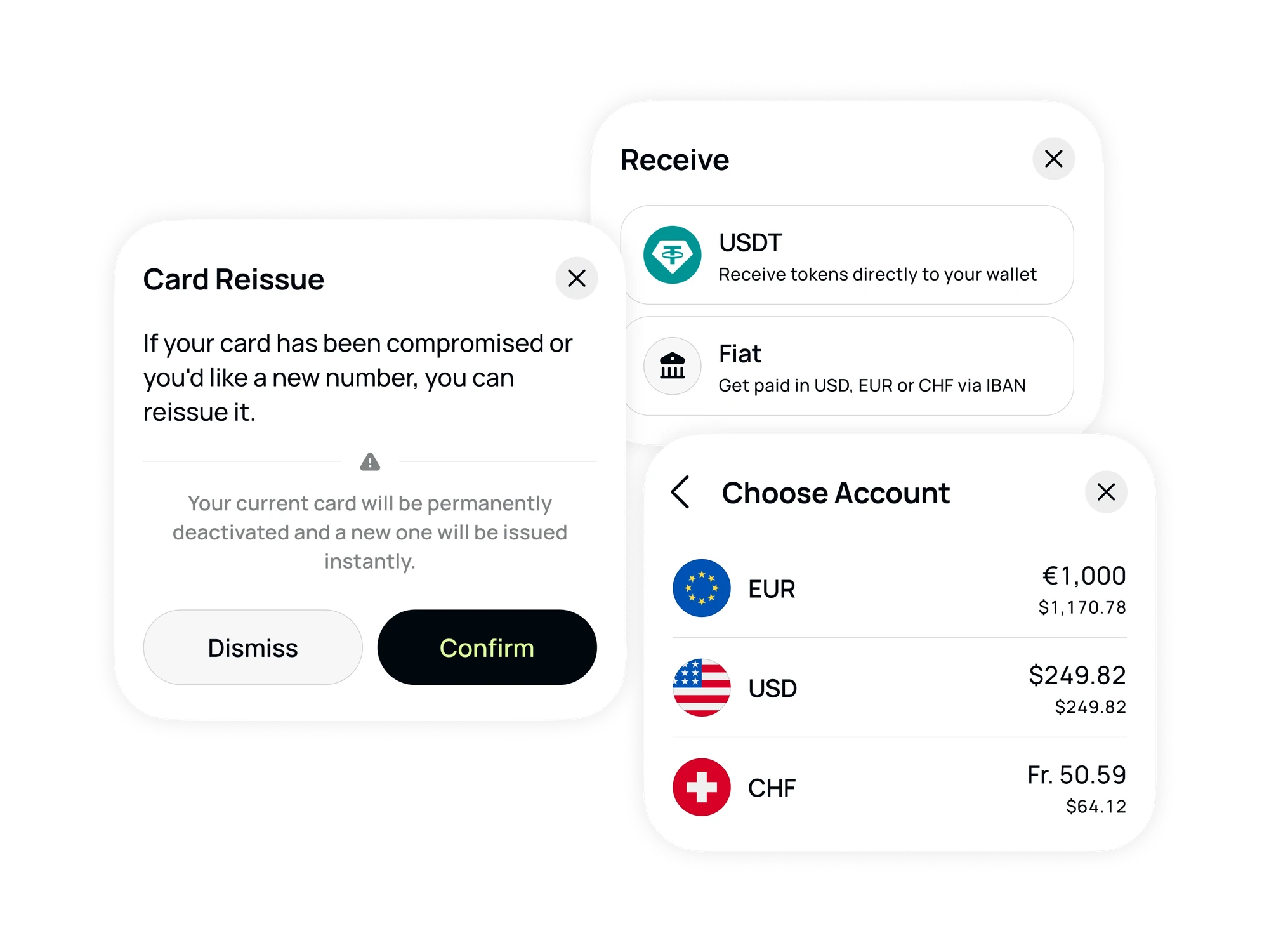
Choosing, confirming and destructive actions happen in bottom sheets, on top of whatever you were doing.
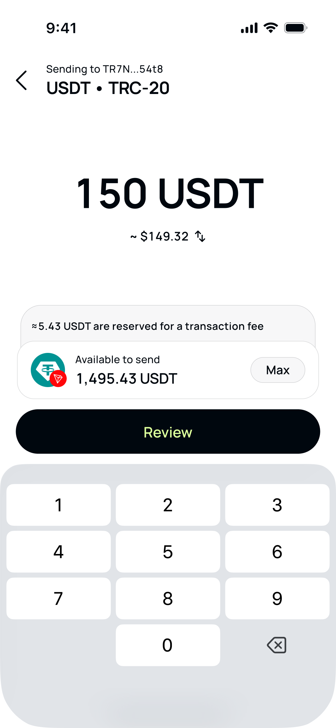
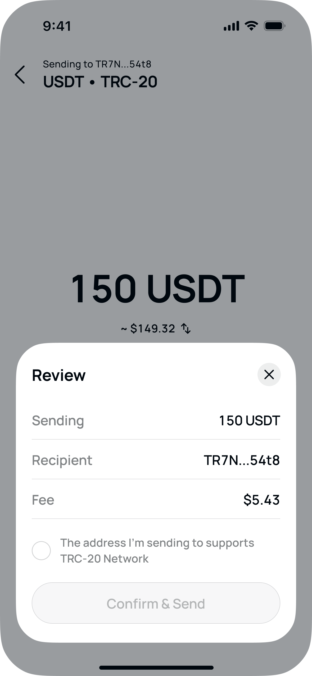
Sending Crypto
This is where a mistake costs real money, so it's the one flow with deliberate friction. The review sheet repeats everything, and Confirm & Send stays disabled until you tick that the address supports the network.
When Verification Fails
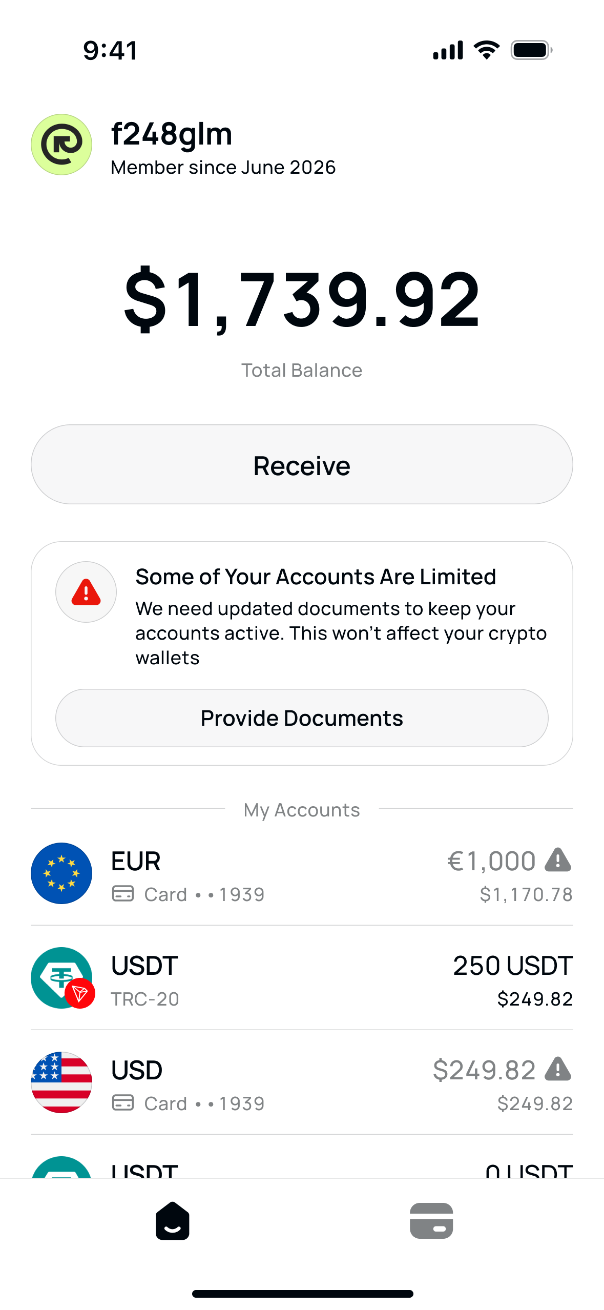
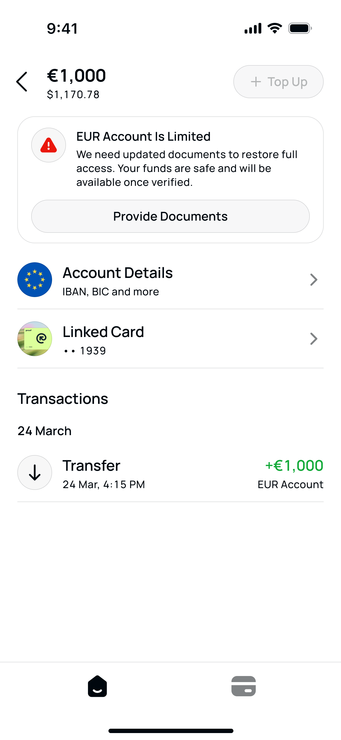
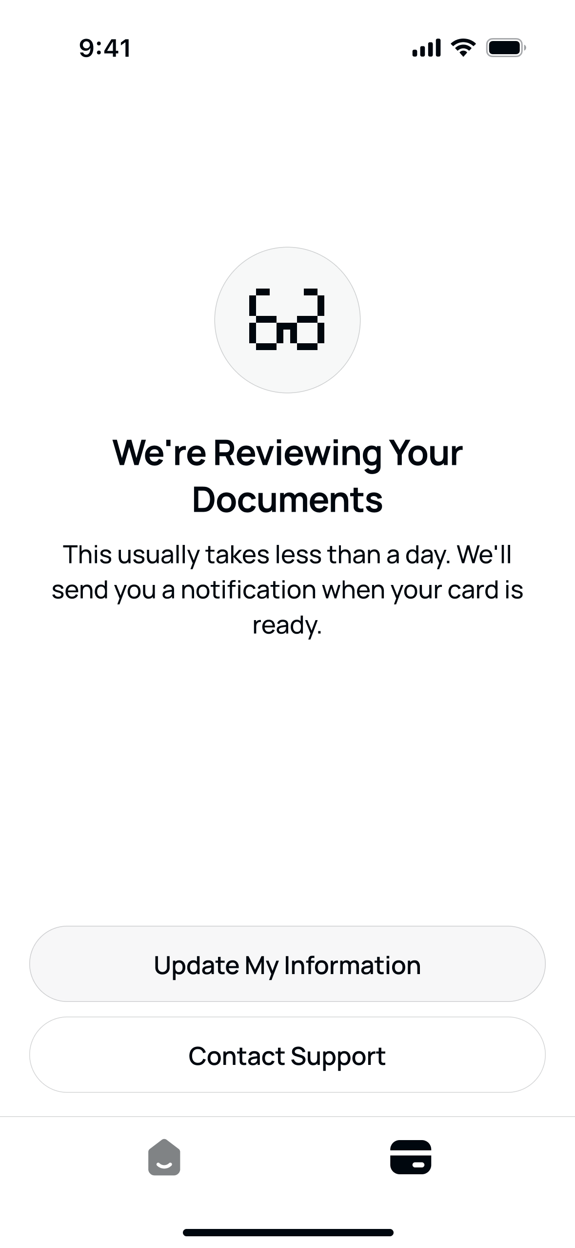
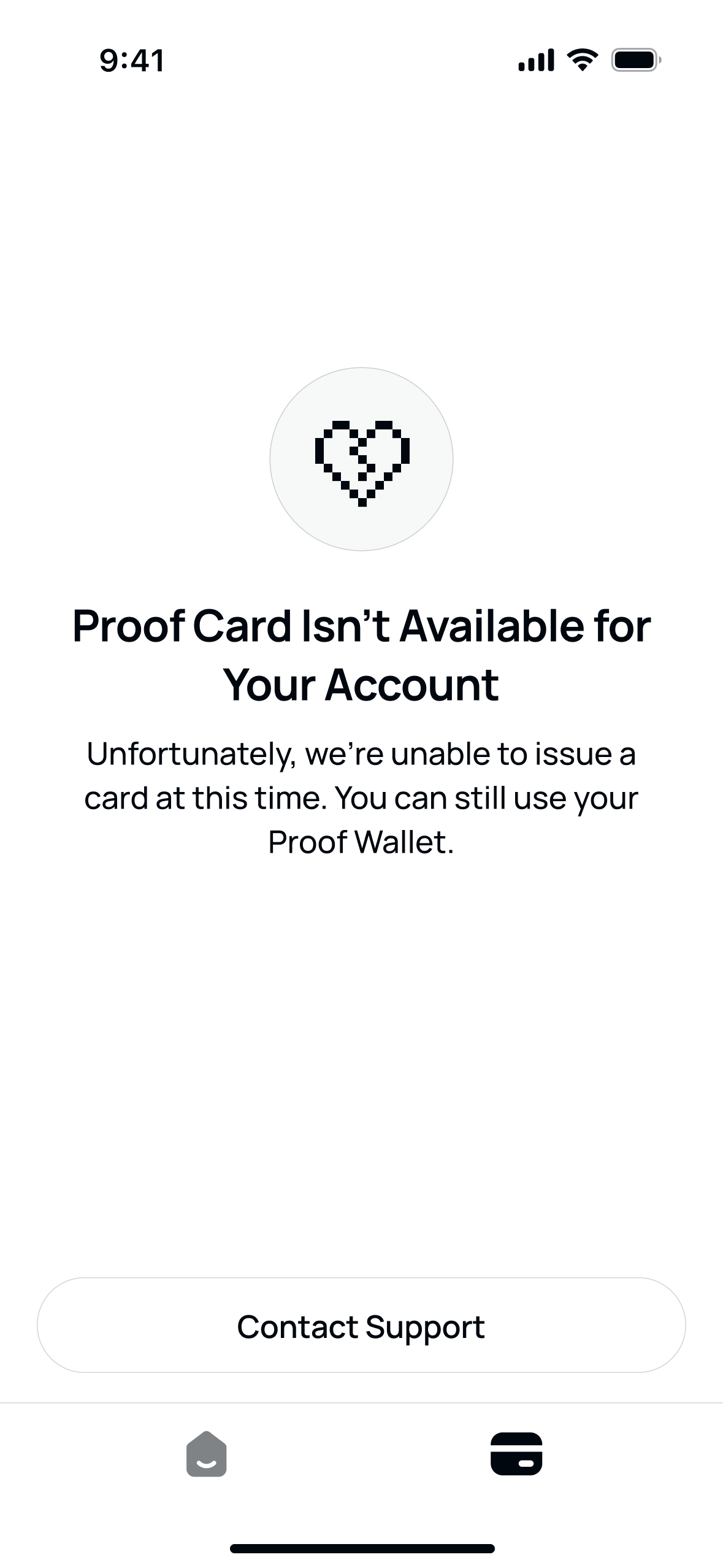
Fiat accounts depend on documents, and documents expire. The account becomes limited, not hidden: the money is still yours, and there's one thing to do. Crypto wallets keep working.
After the documents are sent, the app says plainly where things stand and what to do next.
Result
The timeline was tight, so the trade-off was minimal UI, maximum system: tokens with themes, a small set of components, every state designed from day one. The tokens went straight into the KMP repo, and I shipped the design components through my own PRs.
By the end, the app was built, the crypto wallets worked, and every screen and state was in place. What never came was the funding to sign card-issuing partners, and a card product can't launch without a card. The project wound down.
Fin